Evaluation: How did you use media technologies in the contruction and research, planning and evaluation stages


Media technologies were a very important part of this project and were used all of the time and at each different stage. We of course used a blog to upload all of our work including images and videos, blogs are becoming very popular now because it allows people to show off their work to the world and gain feedback from the readers of their work. All of my research and planning and evaluation was done on this website which is calledhttp://www.blogger.com/. I also used the very popular video website 'youtube' which has
millions of videos created by non media giants, it has allowed the average person with a basic
camera to create content that millions can view and enjoy, it has created some internet superstars
such as 'star wars kid' and 'numa numa guy'. I used youtube for the research part of the blog by
copying the embedded code into the blog so a video could be viewed.

Later on i also uploaded my finished trailer to youtube so i could get comments and gain feedback off
people


To edit my trailer i used a piece of software called Adobe Premier pro which in the end was very easy to use and edit film. I was able to crop scenes and add sounds with ease after getting used to it.

Whenever i edited an image or even just cropped it to put on this blog i used the graphic manipulation software called GIMP which is a free alternative to photoshop which i downloaded for free off the internet at this address www.gimp.org/

Evaluation: What have I learned from my audience feedback

Audience feedback in the media industry is vital because media products are created for the consumers as they are the ones who will be paying the money.

Before starting this project i produced a questionnaire asking members of the public what they thought made a good teaser trailer, i also asked how many people viewed the films website and it turned out that the majority didn't view it so thats why i decided against that as one of my ancillary tasks. This kind of audience feedback is vital to a successful project.


From the audience feedback i retrieved from the questionnaires i found out the following things:

  • The most popular genre of film is horror
  • People think that the best teaser trailers last around 30 seconds (I didn't follow this feedback because 30 seconds wasn't long enough for all of the footage that i wanted to put in)
  • People normally view film trailers on TV
  • A film trailer should only give away a little bit of the story compared to lots or none

However, the feedback i received while i was making the trailer and the ancillary tasks is just as important because they allowed me to see what i was doing wrong and how i could change things from a non biased point of view, i also uploaded my trailer onto youtube and facebook but unfortunately no one added any comments that were sensible, some people did however 'like' my video which has become an important part of facebook. However, i will show you that someone did at least comment on the video which shows what kind of feedback could be possible.

I also gained some feedback through this blog and its ability to place comments on peoples post, i took in all of the feedback and changed parts of my project where necessary, here is some
examples of comments i got.


Evaluation: How effective is the combination of the main product and the ancillary tasks


Before starting out producing all of the tasks i knew that i wanted to create a brand which could be advertised over different types of media, i wanted to create a logo which could be seen everywhere so that it could build up public recognition which would ultimately create interest. My logo was simply the films name 'Stalker' but it wasn't in ordinary font, i downloaded a font from dafont.com called polla which looks like blood written on walls when colored in red. This was a common convention of horror film titles which when shown on posters were always colored in red due to the connotation of red which is blood or danger. I have used this logo over all three of my tasks so everytime someone looks at them they will recognise what film it is related to. This is the logo below:


I think i chose the best ancillary tasks because it is two forms of media coming together to advertise one film, a mix of film and print is one used very often in cinema. All three tasks compliment each other perfectly, when releasing a new film you need to build awareness of it, the poster and magazine front cover do that perfectly. The poster and film magazine can be released before they film so that it builds up recognition.

Evaluation: In what ways does your product use or challenge forms and conventions of real media products

Now that i have produced all of my work i must evaluate it by looking at a series of questions to help me asses whether or not my products have been successful.

Before producing my trailer, poster and magazine front cover, i researched existing materials from the genre of my choice which was horror, I knew straight away that i wanted to produce a video of some kind because last year all our work was print based so i wanted to improve my skills elsewhere, i narrowed down my options to a music video along with a magazine advertisement and a digipack and the film trailer option along with a magazine front cover and a poster for the film. After narrowing down to two options i looked at what would be most suitable for me, i decided that it would be more suitable for me to choose the film trailer option because i watch more movies than i do listen to music. I then began to research all aspects of horror including the conventions of trailers such as paranormal activity which i analyzed earlier. I noted the following things
  • Always set at night time
  • Use of sound effects to create suspense and tension e.g. sound building up
  • Use of quick editing to create a sense of panic
  • Point of view shots
These are some of the things i have tried to recreate in my trailer, i have followed most of the conventions of film trailers, the hardest one to do was to film at night time, the camera i was going to use wasn't very good at filming at night so i had to rethink, i asked if i could borrow a friends camera which had a night vision option. This helped a lot and in the end i think it added to the effect. The blair witch project used night vision cameras. Filming at night on the other camera was impossible because there simply wasn't enough light (obviously), the camera did have a light on the front which was meant to help but at long distances it was useless. I think my use of sound effects helped to make it more scary, the use of heartbeats and woodland ambience and also the screaming, screaming is found in a lot of trailers because it shows the fear someone is going through.

I think my magazine challenges a lot of conventions, mainly because of the amount of information on the front, normally there would be one main story but then little stories on the outside. however, i decided to go against this because i believe it would look to crowded, instead i put some contents down the bottom of the cover where they are not in the way, i personally believe this makes it look a lot cleaner and easier to understand.

My poster challenge one convention of posters because it doesn't include any of the characters on it just a picture of woods with the slogan 'something is out there'. i done this to create unknown and to make the reader guess what the story is about instead of handing it to them. On other horror posters like in the examples i showed before it shows the main villain and what he looks like so its not a surprise when you first see them in the film.

My three final pieces

This is my trailer along with the two ancillary tasks

Trailer


Film poster
Film magazine front cover

Finished movie trailer

Here is my teaser movie trailer for my horror film called stalker


Overall the production of the film trailer went very well, after getting over the intial problem of knowing how to use the software i managed to get used to all of the buttons and what they did, i also worked out how to download sound files from the website http://www.partnersinrhyme.com/pir/PIRsfx.shtml, this website contains 100's of different sound files kept under different categories including one called 'horror, scary, halloween'. After looking at other examples of horror trailers and ones from other genres i took some of the conventions and implemented them in to mine , including the green rating screen at the beginning of trailers, the logo of the production company which shows who made the film and some filming techniques which have been used in horror trailers before. My favorite part of the trailer starts at 0.30 and ends at 0.40, in this bit i have edited it so there is a black screen between each bit of filming so it gives the impression of skipping time and also gives the impression that they have been running for a while, i also added a heartbeat sound effect in the background while this is happening so it gives the impression that the person running is panicking and skipping a beat. Adding heartbeat sound effects is a convention from horror films because it adds suspense and the viewer thinks something is about to happen so it makes them tense, this is what horror films are meant to do.

Stalker magazine cover analysis

This is my analysis for the front cover of my magazine 'popcorn'

Stalker film magazine front cover


For the the other task i decided to create a front cover for a film magazine, because we weren't allowed to use an existing magazine i had to come up with my own name and design, i decided on the name "popcorn" as i thought it was film related, not only that but most magazines have a short title which is written in bold writing so it can be clearly seen on the shelf of a shop for example empire and an example from another genre is FHM, so i decided to follow this convention. I thought popcorn sounded like a modern name for a new film magazine and is related to watching the latest films in cinemas. Here is what it looks like


The main piece of editing i done was on the image of the person, i cropped out the background and made the image darker using the graphic manipulation software called GIMP, as i mentioned before this is the free alternative to photoshop. This is how i edited the photo:


I first loaded up the software


I then opened up the picture in GIMP


I used the free select tool to cut away the background, once the background had been removed i was able to put the image of the woods in its place like this:


I changed the brightness of the person to make them more mysterious and to hide their identity, not only that but it shows that they have two sides to them beacause one side is lighter than the other which the reader can read in to. This is how i changed the brightness:


This is what the final image looks like without all of the magazine front cover content

Film magazine front covers

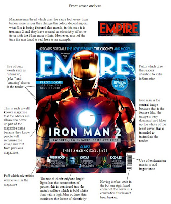
Another method which is used to advertise films is magazines, the two main and most popular film magazines are Empire and total film. The magazines cover stories all over the world and range from everything from film reviews to interviews with celebrities. Film magazines often have a very colorful and well designed front cover which draws in readers, on certain issues there is a special based on just one film, in the january 2010 issue of empire there was a feature on the film iron man 2 and for the front cover they changed the mast head of the magazine from basic color and added an electricity effect to tie in with the films main villain. That issues front cover can be seen below


Below i have analyzed this front cover and looked at the conventions. I will look at these conventions and decide which ones i will include on my front cover.

Empire Magazine front cover analysis


Stalker film poster analysis

This is my analysis of my film poster and how it was made

Stalker film poster

After looking at the conventions of horror film posters i have produced my own one for my trailer this is it.


Overall i have followed the conventions of horror posters but one thing i decided to change was to leave out the villain from the poster as i wanted to create a sense of unknown and mystery about the story, this is backed up by the films slogan "something is out there". looking at the poster the reader will just see an empty forest and wonder what is lurking inside, this will ultimately make them want to find out, this was the method used by the blair witch team, despite only having around $500,000 to make the actual film they managed to make a staggering $248,639,099 worldwide. The stalker logo is the most prominent thing on the poster as the red font and size of the logo stands out from the rest. This is important because the logo will become a brand and it is how the film will be recognised. In the lead up to the film this font/logo will be seen all over the internet and in film magazines. The overall design is very basic but it is important that the reader is only given a few hints about the story and when the film is released, from my poster all that can be read is that it will be set in a forest location and that "something is out there". Another convention i noticed with all of the posters i looked at was the use of dark colours which set the horror feel, i've decided to take it one further by having a black and white theme and to just use red on two sections, this puts more emphasis on the color red which has the connotation of blood, this hints to the viewer that this film may be gory.


I produced the poster using various software including Publisher to put all of the poster together and a piece of free photo editing software called G.I.M.P. which i used as an alternative to photoshop because i didn't have access to it at home. http://www.gimp.org/

Film poster analysis

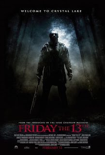
This is my analysis of the film poster Friday the 13th i have identified the conventions of posters and horror posters.

Film posters

Film posters are another way of advertising a film, they can be put anywhere including magazines, cinemas and bus shelters. Using a poster allows the makers to advertise the film so it builds up recognition. here are some example film posters.


Horror trailer analysis

I am going to analyse the film trailer for paranormal activity which has been a massive hit and attracted millions of viewers, like my film trailer the whole thing is shot using handhel cameras to add to the sense of realsim, this technique has also been used in films such as cloverfield and blair witch project, these two films are similar because they aim to scare the audience by making the footage seem real and as if it has just been found.


Paranormal activity like blair witch project gained popularity through advertising the film before it came out, paranormal activity did something different though, they made people sign a petition if they wanted the film to be shown in their local area so people got hyped up about the film and started asking questions like "what is it all about?" This increases popularity and makes people curious about the film. This trailer isn't like most trailers, it is a mix of footage from the film and footage of peoples reaction in the cinema audience, before the film came out it was said to be the scariest film ever, by showing footage of people looking scared, jumpy and even distressed it makes people believe that it really will be scary which ultimately wants people to go and see it. They also use quotes from film magazines including ones like "paranormal activity is one of the scariest movies of all time"


After looking at various trailers i have decided that it would be best to create a teaser trailer for my film i think the most the trailer should last is one minute, in that time the viewer will be able to find out some information without ruining the whole story. The definition of a teaser trailer is as follows "a preliminary advertisement in a campaign that attracts attention by making people curious to know what product is being advertised" (http://www.thefreedictionary.com/teaser. This is what my trailer is going to do along with the poster and film magazine front cover.

unedited footage

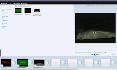
This is the footage that i have captured for the trailer, i must now begin to edit it. One problem that i have found is that my actors were laughing after each scene had finished and sometimes while it was still going so i am going to have to edit these bits out or it will completely ruin the image of horror and terror which i am trying to show.


After a few attempts at editing the software i have found it difficult to get used to, however, i am going to look at online guides which will guide me through how it works and what each button does, i will show the edited footage later on in the blog. I feel that i have enough time to 'mess around' with the software so i can fully understand how it works. Another alternative would be to use windows movie maker but that program is very basic and i will not be able to get the same finish, Adobe premier pro is much more advanced and has many more features.

Adobe Premiere pro


Windows Movie Maker

Location shots

In the storyboard i decided on some locations that i felt would be the right setting for a horror trailer, after this i went out and looked at various locations to see if they would follow the conventions of horror films which are secluded or enclosed locations. due to the nature of the film it was also important that i found a location that gave the impression of being surrounded by trees, here are the location shots of where i will film my trailer.

1


2


3


Shot location 1 was taken in a car park in yaverland, i will film the scene where the camera looks into the rear view mirror to see the attacker sitting in the back seat, i decided this was the best place to do it because at night time the car park is empty so it gives the impression there is no one around, this also made sure that there were no members of the public in the shot which would have ruined the effect.

Shot location 2 was were i would shoot the scene where i am running through the forest being chased by the attacker, i chose this place because there is plenty of room to run but when filmed it gives the impression of being surrounded by trees

Shot location 3 is a secluded road i found which is perfect for filming on because it is quiet and therefore there is no traffic to interrupt filming, due to the fact some of the scenes involve using a car finding a quiet road was vital.

Storyboarding


Storyboarding is an important part of the film making process as it allows the maker to plan what they will be filming. A series of images allow the maker to imagine what the captured footage will look like.My storyboard can be seen above and i have included everything that will be in that certain scene including shot size, camera angle and sound effects.

Results of questionnaire


I Produced a questionnaire which was made up of 13 questions which i thought would help me the most to understand how to produce a good film trailer. Above are the results of 5 of the questions which are the most relevant to the project. The questionnaires were given to 20 people of my age. I thought this was important because i have already identified my target audience which is 16-25 year olds.